Unified Knowledge Hub
A permission-aware search and knowledge platform unifying two portals into one experience, launched to 1.6M employees.
Two separate knowledge portals (one for employees, one for IT Support Engineers) created duplicate content and constant context-switching. I led the design of a single permission-aware experience that serves both audiences from one search, while ensuring employees never even perceive the internal-only knowledge that exists alongside theirs. It launched to 1.6M employees.
The problem
Amazon maintained two separate knowledge portals:
- an IT Portal where employees went for self-service support, and
- a KB Portal where IT Support Engineers (ITSEs) managed customer issues.
Running two systems meant duplicated content, inconsistent search experiences, and constant context-switching for the engineers who relied on both. Together the portals held roughly 3,000 articles, served across desktop, the mobile app, in-office kiosks, and an off-network support portal, so whatever we built had to render consistently everywhere from a single source.
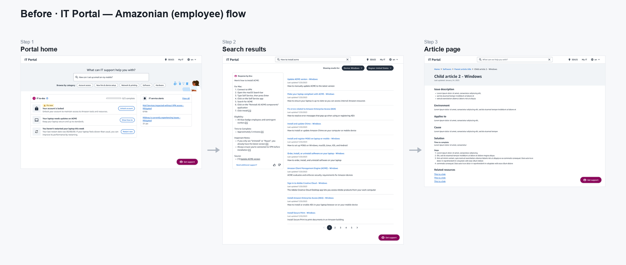
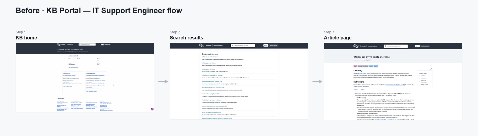
But the real challenge wasn’t merging two websites. It was creating one experience that served two very different audiences, while ensuring employees never became aware that internal-only knowledge existed at all.

My role
I owned the end-to-end UX for the unified knowledge experience, from validating the concept with users through designing the final interaction patterns:
- Planned and conducted usability testing with IT Support Engineers
- Designed the search experience (ranking priorities, filters, and zero-result handling) and the information architecture
- Created consistent experiences across desktop, mobile, kiosk, and an off-network support portal
- Defined permission-aware interactions for multiple user roles
- Drove the accessibility requirements (WCAG 2.1 AA) as launch-blocking criteria
- Drove the design through implementation, partnering with Product and Engineering
Design principles
Two principles anchored every decision.
Invisible boundaries
Employees should never feel like they’re using a restricted version of the platform. Rather than showing locked content or disabled filters, the interface adapts silently based on permissions. Each audience experiences a complete product tailored to their needs.
Minimize workflow disruption
IT Support Engineers work against strict response-time goals and rely heavily on muscle memory. Wherever possible, I preserved familiar interaction patterns and introduced improvements gradually, minimizing retraining during migration.
Designing the experience
Permission-aware search
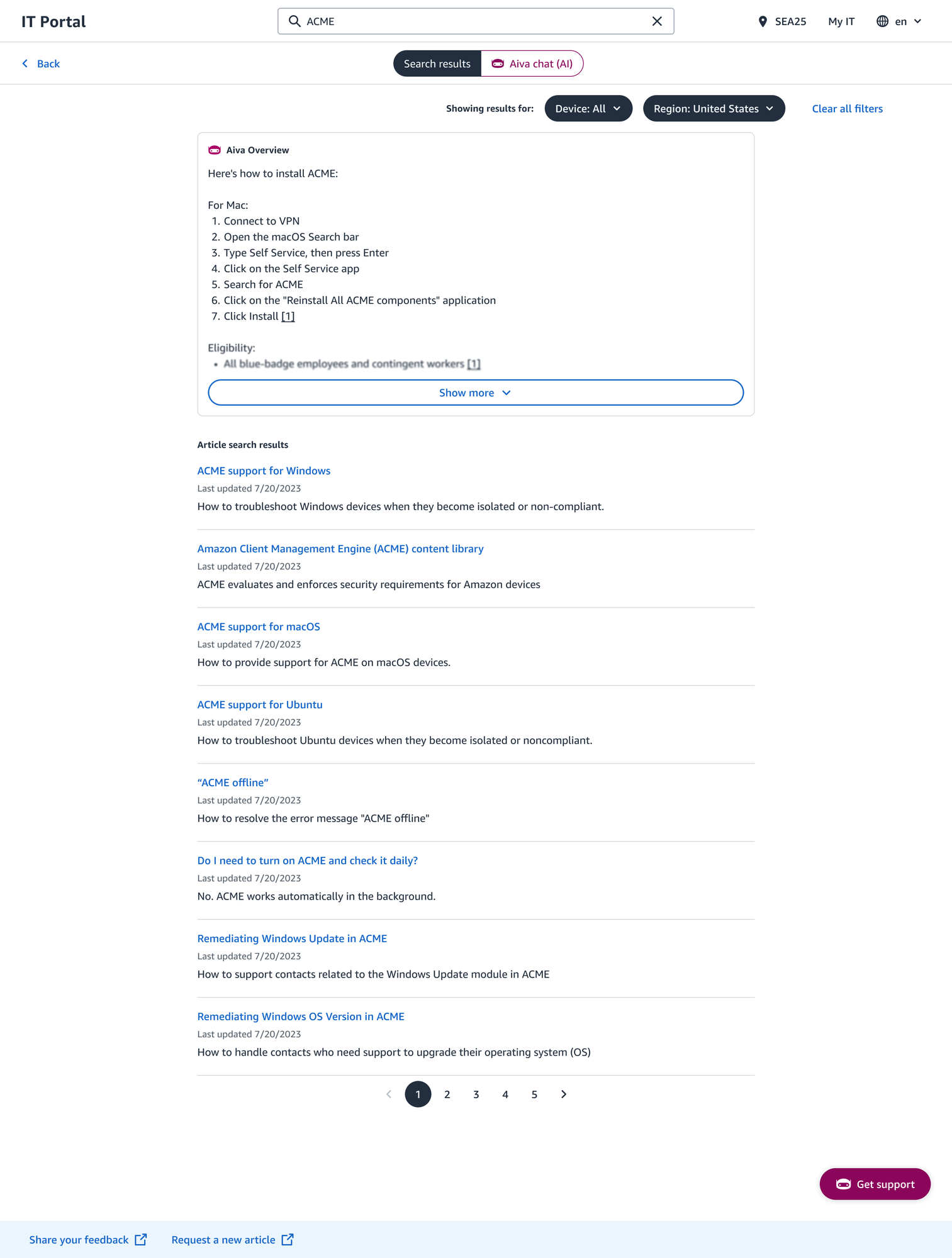
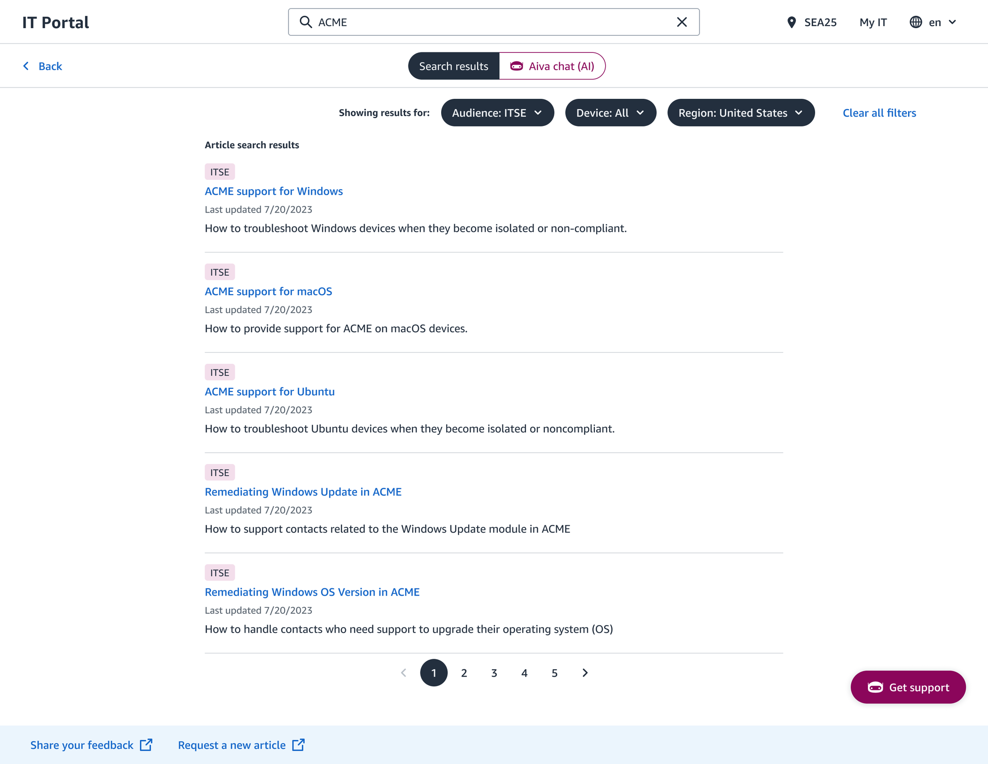
The same search behaves differently depending on the user’s permissions, while remaining completely invisible to employees. An Amazonian and an ITSE can run the same query and each receives a complete, appropriate result set.
The mechanism matters: rather than filtering internal results out of a shared list, the design uses two separate search indexes, so internal-only content is never indexed for employees in the first place. It isn’t hidden; it’s structurally absent. An employee can’t stumble onto it, and there’s no locked row or greyed-out filter to hint that anything more exists: the cleanest possible expression of the “invisible boundaries” principle.
For engineers, results from both collections are interleaved by relevance rather than grouped by source, with internal articles clearly badged. I defined the ranking priorities (title match first, then summary, keyword frequency, freshness, and engagement) and a zero-result state that returns close matches (“we can’t find those exact terms, but these should help”) instead of dead-ending someone mid-contact. Audience, operating-system, and region filters persist across a session so an engineer isn’t re-setting context on every query.
Knowledge articles
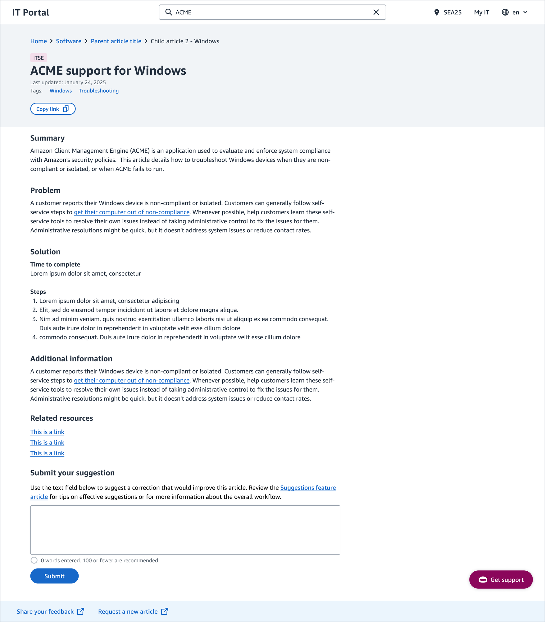
I designed the article experience so an engineer can find, act on, trust, and improve a document without ever leaving the page:
- Taxonomy breadcrumbs (category → hub → article) that orient a user no matter how they arrived: search, link, or bookmark.
- Auto-generated hub pages that assemble the articles under a category from the taxonomy itself, replacing the hand-built landing pages the old system relied on (and that quietly went stale).
- One-click copy on code and command blocks, and expanders for long procedures so a dense article stays scannable.
- Embedded video and inline workflows so an engineer can launch a process or watch a walkthrough in context.
- A suggestion box that routes a correction straight to the content team as a ticket, and a 1–5 helpfulness rating, closing the loop so the people using an article can improve it.
Accessible by requirement, not by afterthought
I drove the accessibility requirements for the platform to WCAG 2.1 AA and wrote them into the spec as launch-blocking, not polish: 4.5:1 contrast (including the internal-only badge), full keyboard navigation, screen-reader-announced result counts and filter changes, and alt text across content types. Anchoring accessibility in the requirements is what kept it from being the thing that gets cut when the timeline tightens.
Walkthrough
Validating the design
Before committing to a unified experience, I wanted to understand whether IT Support Engineers could effectively do their work in a single portal without increasing search time or cognitive load.
I ran concept testing with five IT Support Engineers (2.5 to 11.5 years of experience, spanning remote support, on-site support, subject-matter experts, and L4 engineers). They worked through core support workflows: finding employee-facing knowledge, finding ITSE-only documentation, evaluating search relevance, navigating between article types, and suggesting improvements.
1. Search quality determines trust
Every participant agreed consolidating the portals would improve efficiency, but only if search quality improved.
“I was 100% sure there is an article… I gave up and asked my teammates because I couldn’t find it.”
P1, IT Support Engineer (4 years)
2. Reducing tools reduces cognitive load
Support Engineers regularly moved between seven or more applications during a single customer interaction. Every context switch added load while the customer waited.
“If you’re having to do even a little bit of searching through IT portal or KB, you’ve got multiple windows open now if you’re helping two customers, it just adds to the confusion, adds to your time.”
P3, IT Support Engineer (11.5 years)
3. Engineers need deeper technical documentation
Participants wanted command references, architecture explanations, log locations, and the “why” behind issues.
“Sometimes we get stuck and don’t know what’s going on. If we know the structure of this module, we can dive deep and help much more.”
P1, IT Support Engineer (4 years)
4. ITSEs trust structured docs over AI
Engineers need a trustworthy, structured, officially maintained source they can rely on under pressure.
“I prefer to read a hard-written document… Sometimes [the AI assistant] combines multiple articles and creates confusion.”
P5, IT Support Engineer (2.5 years)
Outcome
The unified knowledge experience launched at the end of July 2026, and we’re monitoring feedback and working on fast-follows. It’s early, so we’re tracking success against two measures defined up front:
- Reduced ITSE search effort: one search location instead of two, cutting the context-switching that added time to every customer contact.
- KB link redirect success: every legacy KB link resolves correctly in the unified hub, so no engineer hits a dead end during the migration.
Before implementation, concept testing validated strong support for consolidating the portals into a single experience, with search quality identified as the most critical success factor. The research directly shaped search ranking, filtering behavior, permission-aware rendering, and article structure before development was finalized. Beyond the product itself, the project established a more proactive UX partnership around future search initiatives.
Reflection
This project fundamentally changed how I think about enterprise design.
Initially, I saw the challenge as one of access control: making sure users only saw content they were authorized to view. Through research and design exploration, I realized the harder problem was designing for asymmetric awareness.
The project also reinforced that influence extends beyond interface design. Mid-project, a partner team shipped an AI-assistant overview that landed at the top of the search results, pushing the actual results far down the page. But people come to a search page to search, not to read an AI summary first, and my own research had already shown engineers reach for a trustworthy structured answer under pressure. I pivoted my designs to absorb the change and still delivered on my team’s timeline, while documenting the usability cost plainly and pushing to revisit decisions that had been made without UX in the room. The core point I made: if an AI answer is going to lead, the experience has to set that expectation, not bury what people actually came for. Adapting quickly kept the launch on track; documenting the evidence turned a top-down disruption into a case the teams could reconsider with data rather than opinion.