Knowledge Flywheel
This case study contains confidential work and is password protected.
Don't have the password? Request access by email or on LinkedIn.
Knowledge Flywheel
Turning support signals into a prioritized, evidence-backed queue of the knowledge that needs fixing, before it fails a customer. Now pursued for investment.
Support content is usually fixed only after it fails on a live call. In a two-day sprint I designed and built a working prototype that reads the signals a support org already generates (tickets, chat transcripts, AI-assistant failures) and surfaces the at-risk articles first, with the evidence attached so an author can act in minutes. The concept is now being pursued for investment.
The problem
I was designing for content teams and product managers who own a large internal knowledge base: hundreds of IT-support articles covering things like VPN setup, device compliance, email migration, and security keys. Their pain, in their words:
- Content is reactive. Articles quietly go stale until a bad support contact or a missed service-level target forces a fix.
- Nobody connects the signals to content health. The support org produces a firehose of signal (tickets, chat transcripts, AI-assistant conversations, satisfaction verbatims) but none of it points anyone at which article is failing.
- Failures are discovered live. Frontline engineers find the gaps in real time, with a customer waiting, because a feature shipped with no documentation or a fix went out without the article being updated.
The through-line: the information needed to prevent these failures already exists; it’s just never routed to the person who can act on it.
Scoping under pressure
The full vision was a three-loop “flywheel”:
- Reactive: mine post-contact data to flag broken articles.
- Proactive: watch upstream engineering signals (change requests, maintenance notices, roadmaps) to flag content risk before a change ships.
- Coverage scoring: a living health map of content by service area.
With one to two days, I made a deliberate call: build Loops 1 and 3 as a believable, end-to-end experience rather than mock all three shallowly. A prioritized fix-queue grounded in real evidence, plus a coverage map, is the part a stakeholder can actually feel. Loop 2 stays in the narrative as the roadmap.
What I designed
A four-area workspace. Here’s each area and the reasoning behind it.
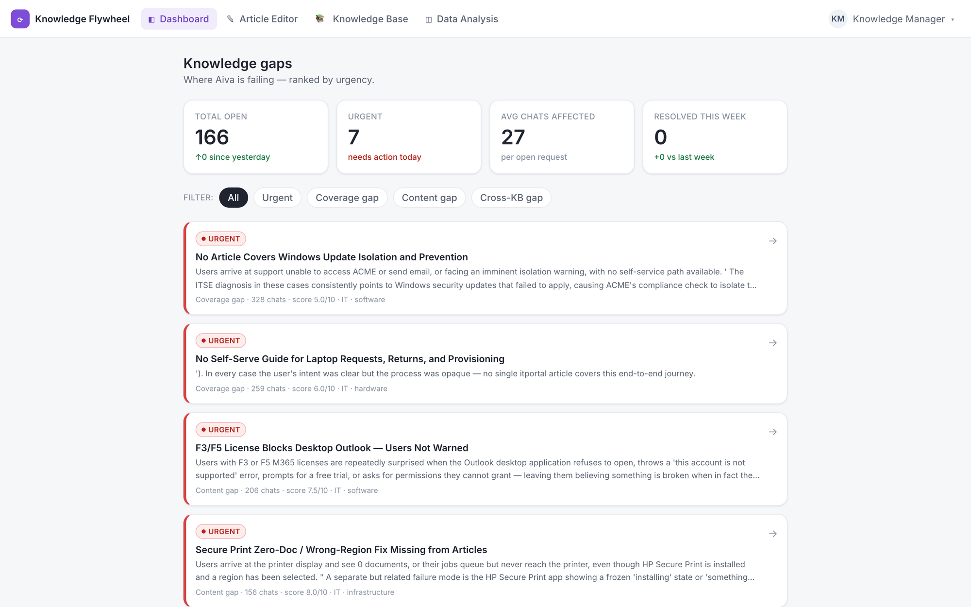
1. The dashboard: the “fix this next” queue
The landing screen answers one question: what should I fix right now? A single headline alert makes the highest-severity work impossible to miss, above a prioritized list where each item is classified by a gap taxonomy I designed to match how the team actually thinks about failure.
Designing that taxonomy was the core IA work. “Broken content” isn’t one thing: missing, wrong, and inconsistent-across-portals each imply a different fix and a different urgency, so each earned a distinct label, color, and priority weight.
2. The evidence drawer: trust through receipts
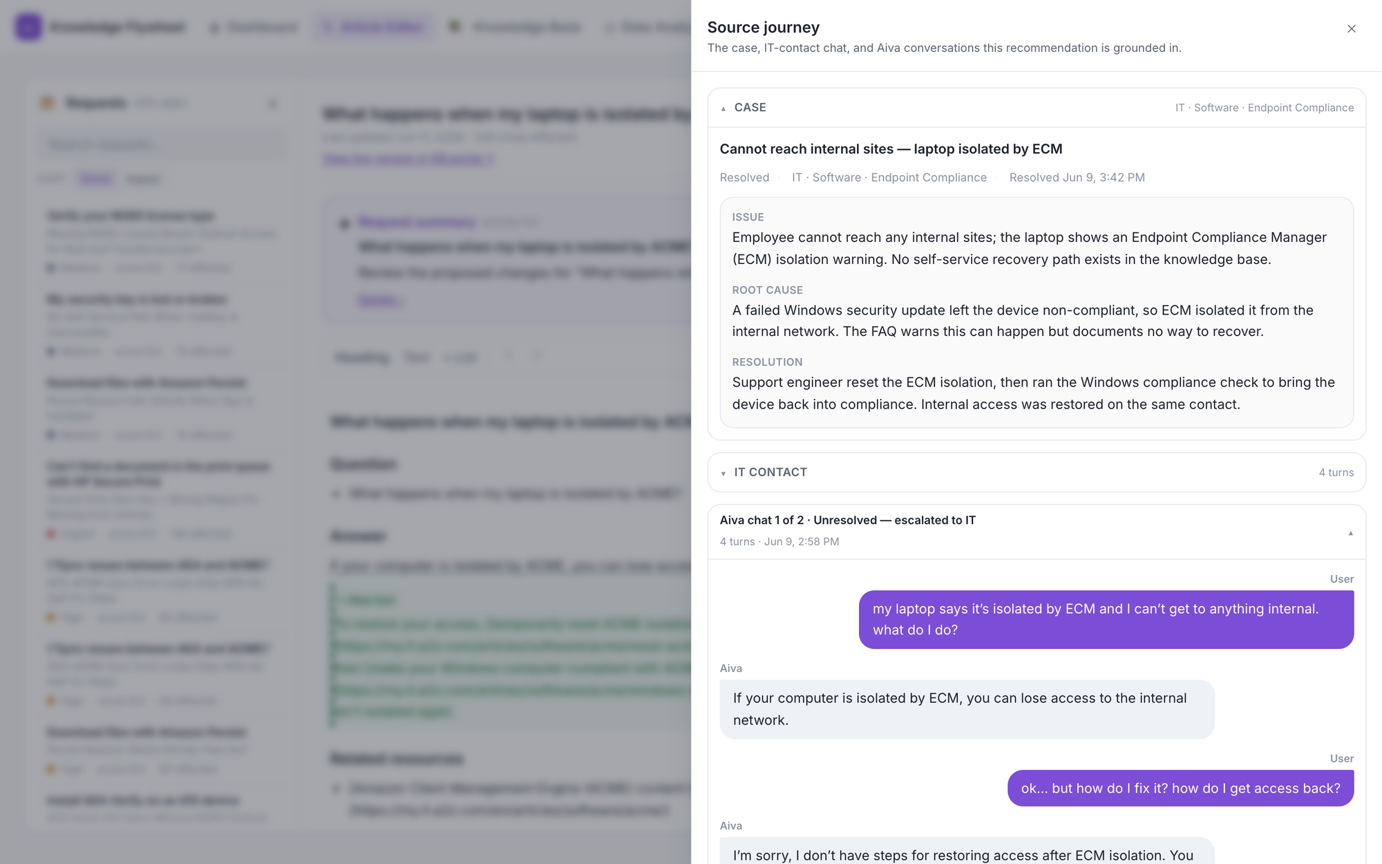
The single most important design decision. An AI flag that says “this article is wrong” is easy to ignore; a flag that says “here are the three customer conversations where this article failed” is not.
Every recommendation opens a drawer showing the raw evidence behind it: the support case, the contact transcript, and the AI-assistant chats where the article failed to resolve the issue. I also designed a PII-safe export state (the portable export omits the underlying chats and case notes) because anything touching real customer data has to be handled responsibly, and showing that awareness matters to the people who’d approve this tool.
3. The article editor: close the loop without leaving
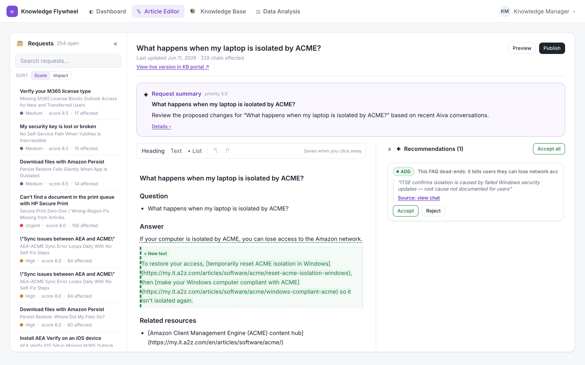
Flagging a problem is worthless if fixing it means bouncing to another system. So the editor lives inside the tool: inline editing with an AI-recommendations panel proposing specific changes alongside the live text, a “view live version in KB portal” link to compare against what customers currently see, and a deliberate “Publish this article?” confirmation, because publishing is irreversible and the moment deserves a clearly-worded gate.
4. The coverage heatmap: the zoomed-out view
The strategic view for content and product leads: a health map scored by service area (healthy, at-risk, or critical) so weak spots are legible at a glance, and it surfaces which topics are failing the AI assistant’s answers and which have no coverage at all.
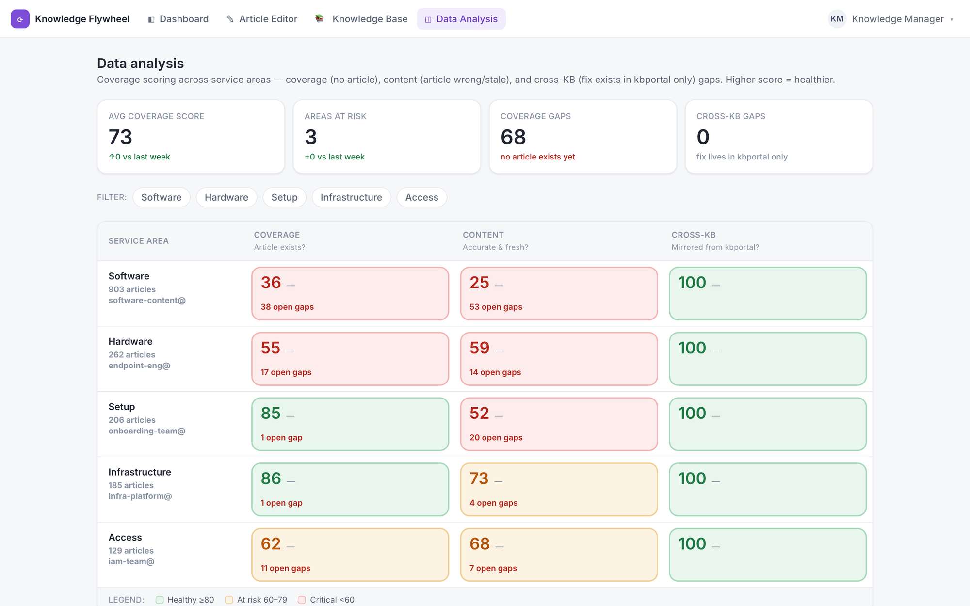
The dashboard answers “what do I fix today?”; the heatmap answers “where is my whole content estate weakest, and where should we invest?” Two audiences, two altitudes: one connected system.
Design decisions worth calling out
- Evidence over assertion. Every AI claim is backed by viewable source conversations; the tool earns trust rather than demanding it.
- Severity drives the layout. The most urgent work is the loudest thing on the screen. Priority isn’t a column you sort by; it’s the visual hierarchy.
- Realistic content. I populated the prototype with authentic support articles and plausible failure transcripts, because in a stakeholder demo, real content is what makes the value land instantly.
Prototype
Outcome
Built in a two-day sprint, the prototype was compelling enough that the concept is now being pursued for further investment. It moved the idea from a pitch into something stakeholders could click through and believe.
The concept targets three outcomes: reduce content-related escalations by catching gaps before a service change lands, shrink the time from a service change to the corresponding content update, and eliminate “no article exists” moments for new feature launches.
What I’d do next
- Validate the priority model with real content authors. The severity weighting is my hypothesis; I’d test it against how authors actually triage.
- Instrument the recommendation-acceptance loop. Track which AI suggestions get accepted versus overridden and feed that back, a real flywheel that gets sharper the more it’s used.
- Design the trust ceiling. Decide where a human must sign off versus where the system can act autonomously, especially around auto-publishing.