Upskilling marketplace for hourly employees
Unifying Career Choice and 17 fragmented upskilling programs into one catalog for 1M+ hourly employees, launched in 2023.
Amazon's hourly employees couldn't find the growth opportunities available to them: 17+ upskilling programs were scattered across disconnected tools, and Career Choice's strong brand made many assume it was the only option. Leading the design pod, I owned the information architecture, research, and stakeholder alignment, and mentored a second designer focused on visual execution, for a single career-development catalog that made every program discoverable while preserving Career Choice's identity, and it shipped to associates in 2023.
The problem
Hourly employees who wanted to advance their careers felt lost, from how to search for and evaluate their options, to how to apply and be selected. That lost, ignored feeling created employee-relations risk and left people with the impression that there was no future for them at Amazon.
- Employees had to hunt across disconnected tools to piece together a fragmented picture of 17+ upskilling programs, with no single place to explore.
- Most opportunities were effectively invisible: despite 17 available tracks, just 872 L1–L3 employees had taken part in upskilling that year (YTD, outside Career Choice). Many only heard about a program from a break-room flyer or by chance.
The signals were stark:
- 82% of hourly associates wanted to build a career at Amazon (N=6,904), yet their two most common pain points were “I don’t know what opportunities are available to me” (26%) and “I don’t have enough guidance or support” (26%).
- 36% of voluntary exits cited a lack of career-advancement opportunities, and 59% of those who left never explored other internal opportunities first.
The business tension
As a tuition-benefit program that pays for external schools, Career Choice had strong brand recognition among Amazon’s hourly workforce. Leadership feared that placing it in one unified experience alongside 17 other Amazon-run programs would dilute its distinct value and confuse employees about the difference between a tuition benefit and direct training programs.
So the work had to solve two things at once: create a single destination for all upskilling opportunities and preserve the integrity of Career Choice as a keystone program.
My role
I led the design pod on this project, a level above the second designer, whom I mentored. I owned the information architecture, user research, and stakeholder alignment, along with the broader Careers information architecture this experience lived within. My teammate focused on visual design and execution; I set the direction, drove the research, and carried the cross-functional alignment.
The solution
Employees come with different mental models, so the experience offered two ways in, serving both goal-driven and exploratory users:
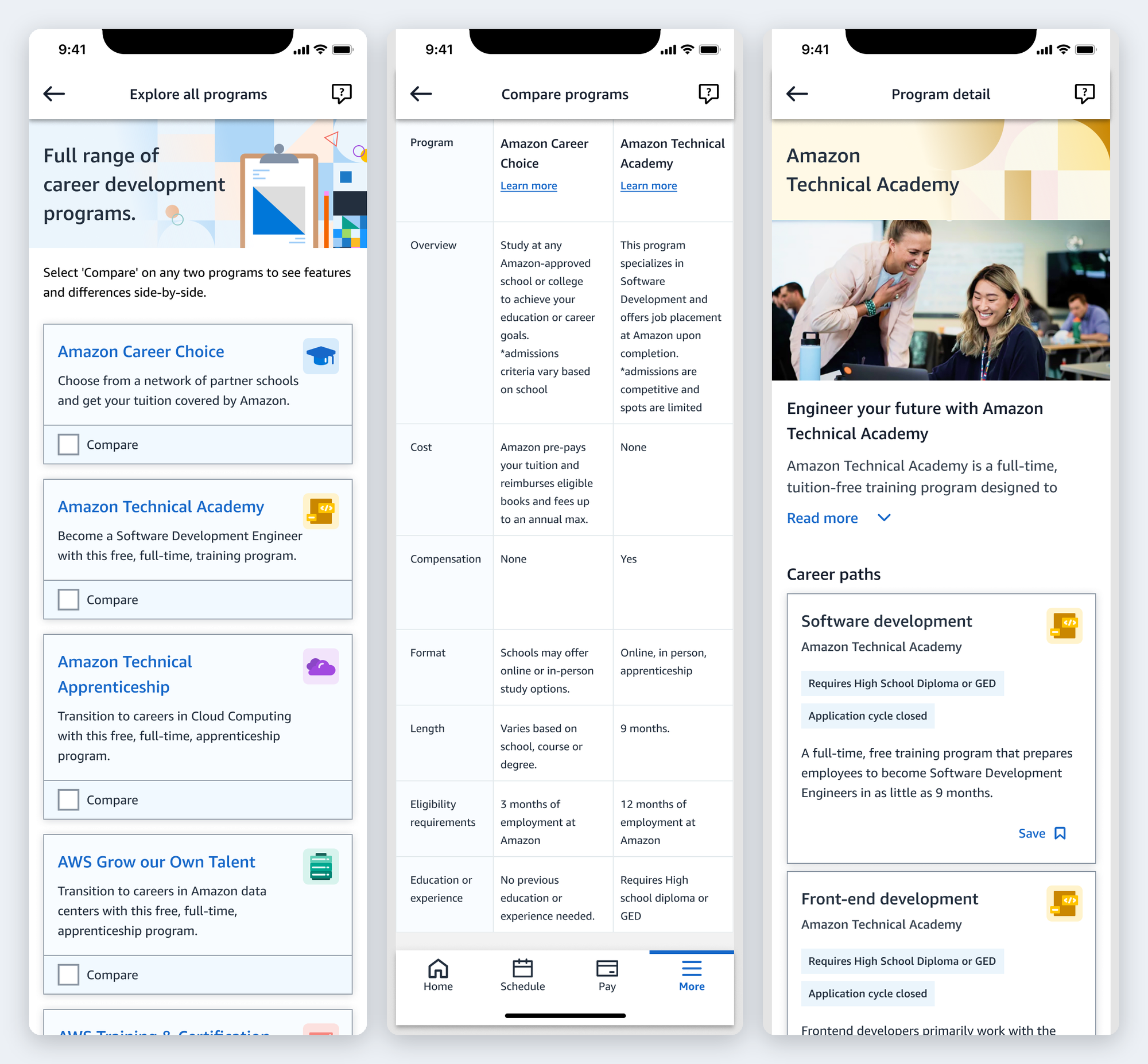
1. Browse by program: for those who know what they’re looking for.
- A program catalog surfacing every offering in one place.
- Program cards with digestible overviews (application cycles and prerequisites) for quick evaluation.
- Side-by-side comparison to reduce cognitive load when weighing options.
- Program detail pages surfacing every career pathway a program covers.
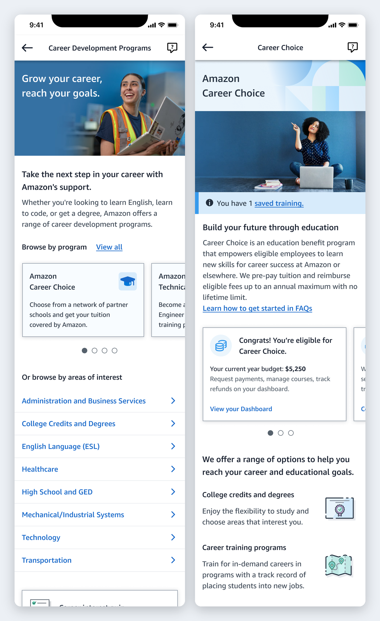
2. Browse by area of interest: for those still discovering what’s possible.
- Only categories covered by available programs are surfaced, keeping options relevant and actionable.
- Interest → career → school/training detail pages let an employee move from “I’m curious about healthcare” to a specific program they can act on (Career Choice for tuition-covered paths, direct training programs for others).
Research & feedback
I ran usability testing with hourly associates (split between general associates and those already familiar with Career Choice) to validate a single, browsable catalog. The headline: discovery is easy when options are organized, but confidence comes from clarity.
- A single catalog resonated. Participants were enthusiastic about one place to explore, and several discovered programs they hadn’t known existed during the test itself.
- Browsing by area of interest emerged as a preferred path, a new way in that several participants gravitated to first (enough that some missed the browse-by-program option, pointing to a visual-hierarchy tweak).
- The Compare tool was unanimously called helpful (selecting two programs to see features side-by-side), though it needed a more explicit first-landing callout to be noticed.
- Program-card descriptions are the first thing users read to understand a program, so clarity there is critical.
- For closed application cycles, users wanted to know when it reopens (clear deadlines + a save function) more than they wanted a substitute recommendation, a signal to prevent dead ends without pushing alternatives.
- Career Choice discovery held up. The combined catalog didn’t bury it for people specifically seeking it, and the simplified landing page plus Career-Choice-specific interest paths tested well.
“I think this is going to be really helpful for someone who may have stepped into the Amazon world and not realized how much there is to help you grow.”
Usability-test participant
Key decisions I owned
- Two doors for two mental models. Rather than forcing one taxonomy, the IA offered both browse-by-program (goal-driven) and browse-by-area-of-interest (exploratory), so employees who knew what they wanted and those still exploring both had a natural path.
- Preserving Career Choice inside a unified catalog. Resolving the brand-dilution tension by giving Career Choice a simplified landing and its own interest paths, then validating with a mixed cohort that its discoverability held.
Outcome
It shipped in two phases: a standalone catalog launched inside A to Z Careers in December 2022, and the fuller experience I co-designed (the catalog integrated with Career Choice, browse-by-interest, and side-by-side program comparison) launched in July 2023 for US hourly employees.
The tension leadership had worried about held up in production: Career Choice kept its distinct identity inside the unified marketplace, and every employee got a real starting point for career growth, regardless of which programs they qualified for. It delivered on a PXT leadership goal for an authoritative, comparable catalog of upskilling programs, with sponsorship at the VP level.
What I learned
-
Research is the fastest way to align anxious stakeholders. The hardest part of this project wasn’t the IA; it was the fear that a unified catalog would dilute Career Choice. What moved the decision wasn’t a better argument; it was evidence. Testing with a deliberate mix of Career Choice loyalists and newcomers showed the brand held up, which de-risked the exact thing leadership worried about. I’ll reach for a targeted test over a debate every time.
-
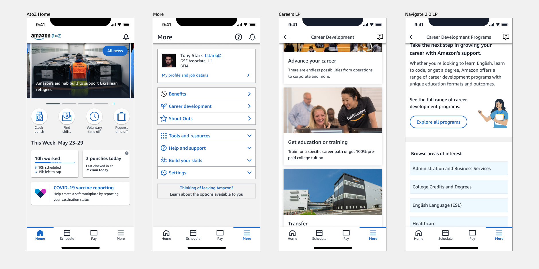
The connective IA matters as much as the feature, and I’d test the way in earlier. The catalog itself tested well, but the friction surfaced at the ingress from the existing Careers page, where labels sometimes obscured the path in. Next time I’d validate the entry path and the surrounding IA seams from the start, not just the feature in isolation.
-
Discovery isn’t decision. Organizing options makes them findable, but people only act when uncertainty drops: clear descriptions, visible deadlines, comparison, a way to save. It reframed the job from “surface more options” to “reduce the uncertainty around each one.”
-
Serving two mental models was a deliberate choice, not a compromise. Goal-driven and exploratory users think differently, so the architecture gave each a real path. I learned to build the structure around how people actually think, not around the organization’s list of programs.
Led the design pod, mentoring a second designer focused on visual execution, in partnership with product, research, and program stakeholders.