Career-discovery experience for hourly employees
The foundational career-discovery experience for Amazon's 1M+ hourly employees, now live across the US.
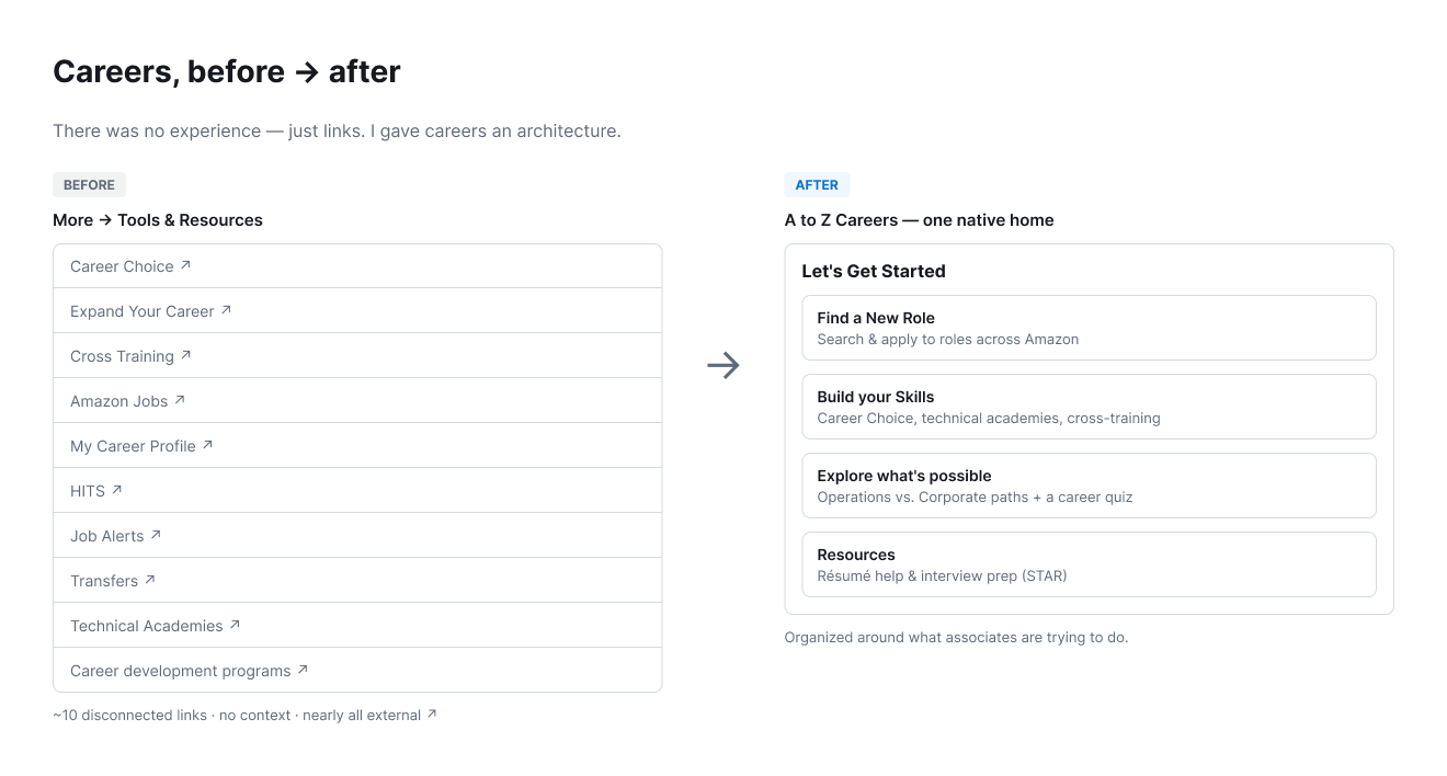
Amazon's hourly associates wanted to grow, but the way forward was invisible: career resources were scattered across ten disconnected links, nearly all pointing off to separate external sites. As the lead designer and researcher, I built A to Z Careers: one native home that reframed the whole space around what associates were trying to do, validated it directly with associates, and shipped it as the foundation other career products would be built on.
The problem
Amazon’s hourly associates wanted to build careers, but the path forward was scattered and hidden. Career resources lived as disconnected links spread across the A to Z app, with no single place to understand what was possible or how to get there. The two things associates told us most often were blunt: “I don’t know what opportunities are available to me,” and “I don’t have enough guidance or support.”
The data made the gap impossible to ignore:
- 83% of associates wanted to build a career at Amazon, but only 21% were satisfied with their career and development.
- 59% of former associates cited limited advancement opportunities as an important reason for leaving.
- 47% either didn’t see enough (21%) or didn’t know what (26%) opportunities were available to them.
- Those resources lived as ten disconnected links in the app’s More/Resources area; and, apart from Career Choice, nearly all linked out to separate external sites, a frequent source of associate frustration.
My role
I led design and research end to end on this project: the product strategy, the information architecture, the interaction design, and the validation research with the associates the product was for.
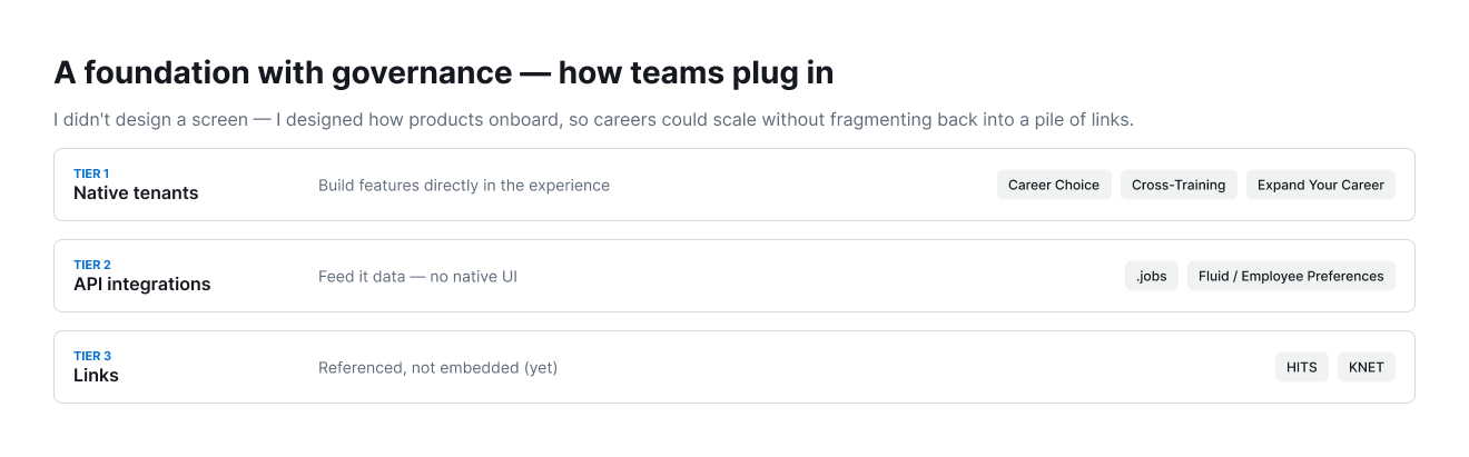
A to Z Careers was the foundation: the first dedicated career experience in the app, built so that other teams’ career products (including the later career-development catalog I went on to co-design) could plug into a coherent whole rather than adding to the sprawl.
The approach
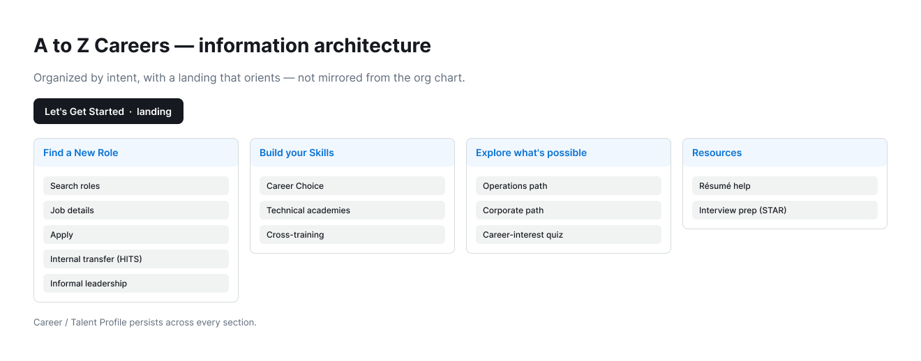
The core move was to stop organizing the experience around Amazon’s internal teams and products, and start organizing it around what an associate was actually trying to do.
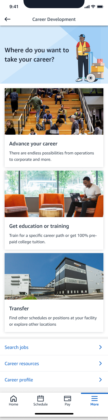
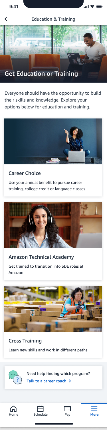
- One native home, split by intent. I consolidated the scattered links into a single A to Z Careers experience and gave it clear sections (a Let’s Get Started landing to orient people, Find a New Role, Build your Skills, and Resources), deliberately separating career advancement from training so each had its own waypoint instead of being jumbled together.
- Framed by use-case, not org chart: career opportunities (finding and moving into new roles) and development opportunities (training, skills, and programs like Career Choice), because that’s how associates thought about their growth, not by which system a resource happened to live in.
- New, visible ingress points that lifted career discovery, development programs, skill building, and job search out of buried resource lists and onto a clear path.
- A foundation with governance, not just a screen. I designed it as a multi-tenant experience other teams could onboard into over time, with a tiered model for how a product joined (from native tenants that build features directly in the experience, to API integrations that feed it data, to lightweight links), so the space could scale without fragmenting back into the sprawl it replaced.
Designing for three real journeys
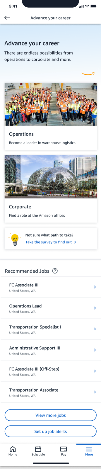
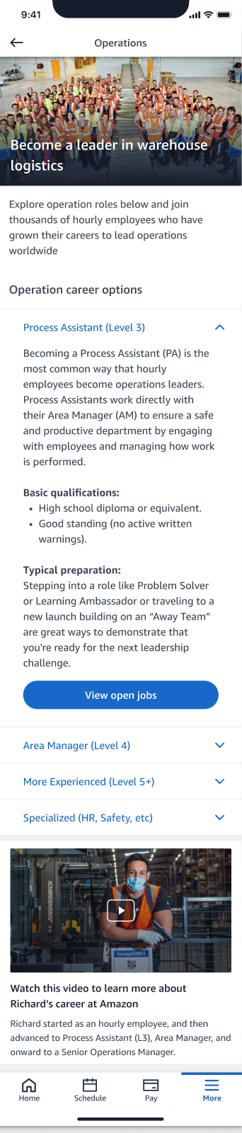
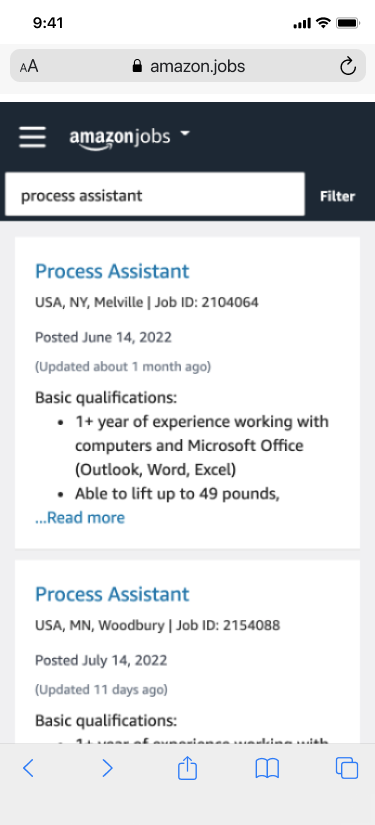
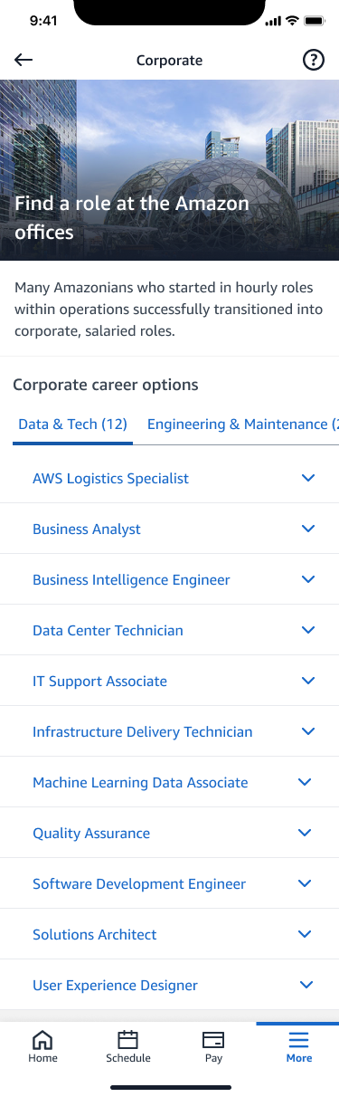
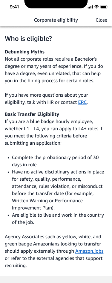
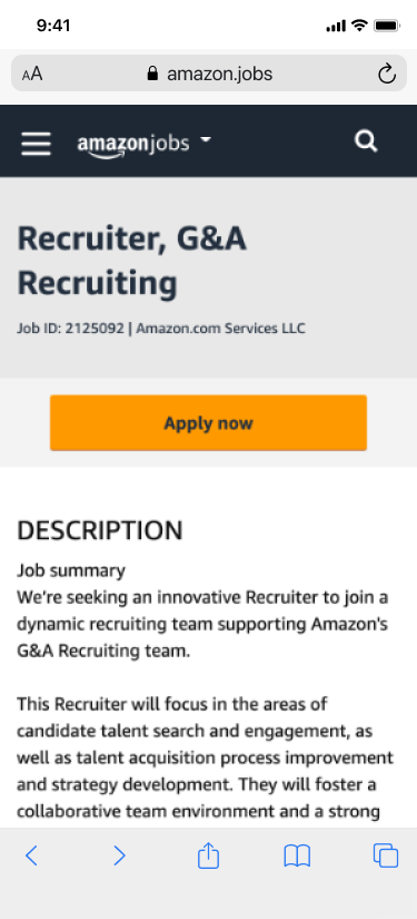
Rather than design screens in the abstract, I anchored the work in three real associate journeys (each a person with a specific question) and walked Director- and SVP-level leadership through them end to end. Seeing the product from the associate’s side is what kept the architecture honest.
“What's my next step, and how do I move up to L5?”
“Can I move into corporate HR, and am I even eligible?”
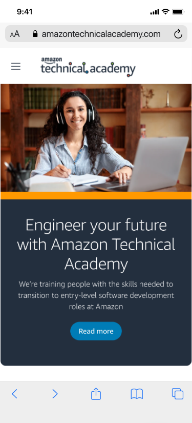
“How do I build tech skills, and can I get training paid for?”
Validation research
Before launch, I ran ten 1:1 usability sessions with hourly associates, in person across three fulfillment centers, facilitating each, synthesizing the findings, and taking them straight into design and copy decisions. The headline: the structure worked, but confidence, and the words we used, mattered as much as the navigation.
- Everyone wanted to grow, but no one had a clear next step. Associates leaned on peers and managers to figure out how to advance, and gravitated to the roles they’d simply had the most exposure to.
- “Operations vs. Corporate” was a real barrier. Most associates couldn’t articulate the difference, and “corporate” felt like a different, unreachable world: “I’m not gonna jump all the way up to corporate.” Surfacing it as a real, achievable option was itself a design job.
- The Career Survey resonated strongly. Associates correctly intuited it would help surface paths they didn’t already know about, a way in for people who couldn’t yet name what they wanted.
- Interview prep was a major, unmet barrier. One associate described failing an internal interview simply because no one had told them it followed a structured format, a clear, fixable gap.
- Navigation habits fought the design. Half the participants instinctively went to the catch-all “Tools & Resources” out of habit; the label “Resources” read as everything, not careers; and “Advance your career” felt too aggressive for people happy in their current role.
“This is really nice, because I know there’s a lot of talent in Amazon as a tier 1 that might be interested in looking for another path but just has no idea.”
Usability-study participant
From research to decisions
Every insight had a short path to a change:
“Resources” read as everything, not careers; half the participants defaulted to the catch-all out of habit.
Relabeled the entry and moved résumé & interview help into the career-advancement path, where people actually looked.
“I’m not gonna jump all the way up to corporate.”
Reframed Operations and Corporate as parallel, reachable paths, not a leap.
Associates who are hard of hearing or read English as a third language gave up on dense, jargon-heavy copy.
Made plain, accessible language a core requirement, not a final polish.
Key decisions I owned
- Organize by use-case, not by org chart. The single most important decision was to structure the experience around associate intent (finding a role, growing skills) instead of mirroring which internal team owned which tool. It’s what turned a pile of links into a path.
- Make “corporate” feel reachable. Research showed the biggest opportunities read as not for me. I treated that perception as a design problem, not just a content one: surfacing paths and framing them as achievable.
- Let the associates’ words rewrite the interface. I carried the research straight into copy and IA changes: softening “Advance your career,” clarifying the “Resources” label, and pushing for plain, accessible language throughout.
- Design for what comes next. I built the structure as a foundation other career products could onboard into, so the experience could grow without fragmenting again.
Outcome
A to Z Careers launched to all US hourly associates (L1–4), more than a million people, in December 2022, the first unified career experience in the app, and the foundation a multi-tenant roadmap of career products was built on afterward. It replaced a scattered set of links with a single, intentional path, and it set the direction for everything that came next, including the career-development catalog.
Post-launch validation
Real, sustained adoption for a destination that didn’t exist before the launch:
By 2024, roughly 1 in 6 people who opened A to Z each month explored the Careers section, about 160K of the app’s monthly users.
To see how it held up in production, I also partnered with UX Research on an in-market usability study with hourly associates. The signal was clear on both sides:
- The content landed: a 4.5/5 mean usefulness rating. Associates valued having every career and development option in one place, and several only realized certain resources existed during the sessions themselves.
- Discoverability was the real gap. Most participants couldn’t find the careers home on their own; it sat buried under “More,” and few knew it existed. The ingress friction I’d flagged pre-launch had surfaced in production, exactly where I expected it.
That became a focused iteration roadmap: raise the entry point (a dedicated tile / bottom-nav placement, paired with on-site awareness), clarify labels like “Advance your career” (read as jobs or training), move interview and résumé help into the career-advancement path where people actually looked for it, and make the career-interest quiz more visible with a less ambiguous rating scale.
It reinforced the project’s core lesson: a strong destination isn’t enough if the way in is hidden; the connective IA and discoverability matter as much as the experience itself.
What I learned
-
Research isn’t a phase; on this project it was the design. Owning both meant every insight from those sessions had a direct, short path to a decision. Sitting across from associates in their own buildings taught me things no survey could, and it’s why the structure held up.
-
Meet people at their mental model. Associates didn’t think in org charts or product names; they thought in “how do I move up?” Designing around their intent, not our internal structure, was the whole unlock, and the thing that made scattered resources finally feel like a path.
-
A foundation is a design problem, not just an engineering one. The hardest part wasn’t any single screen; it was designing connective structure for a future I couldn’t fully see: an experience other teams would build into. I learned to design the seams, not just the surfaces.
-
Accessibility is the floor, not the finish. The associates most in need of a way forward were the ones the old experience failed hardest. That reframed plain, accessible language as a starting requirement, and it’s stayed with me.
Lead designer and researcher, in partnership with product, engineering, and program stakeholders across the A to Z Careers team.